Deterministic Balanced italicification forum draft
Suggested title
Glyphs MCP: a deterministic Balanced starting point for an italic companion
Post
I have added an experimental deterministic Balanced mode to the italic first-pass workflow in Glyphs MCP.
The goal is deliberately limited. An italic often acts as a companion to the Roman for contrast and emphasis in text. This tool helps a designer construct a reproducible mechanical starting point for that companion. It does not create or replace a deliberately drawn italic.
Balanced now runs entirely in pure Python and does not depend on the installed Glyphs Transformations filter:
- build a Raw affine shear;
- apply a conservative straight-stem correction at partial strength;
- interpolate that compatible geometry with
curve_strength; - apply the independent final
stem_compensation.
At the defaults (curve_strength=0.75,
stem_compensation=1.0), accepted straight stems converge to their Roman
perpendicular width. Because the final compensation is complete, the
intermediate blend can be visually subtle. Curves and ambiguous constructions
are deliberately left for the designer.
Review is a real dry run on detached layer copies. It reports topology, anchors, bounds, metrics, detected and skipped stem pairs, and recursive component diagnostics. Balanced never changes path count, node order, node types, smooth flags, or curve handles during compensation.
Component safety is based on construction, not glyph names or Unicode
categories. Translation and commuting linear transforms are accepted.
Reflections, rotation, non-uniform scale, cycles, unreadable transforms, and
component-master mismatches block the reviewed batch when their matrices do
not commute with the requested shear. Nothing is silently skipped. A designer
can inspect the report and explicitly rerun with skip_glyphs.
This is why a mechanically slanted d or q can lean the wrong way in one
font but not another. Inter builds some of these forms with reflected
components, while IBM Plex Sans draws them directly. It is a construction
difference, not a glyph-specific negative angle.
I tested the deterministic pipeline on a fixed Broad-Latin set:
- Inter v4.1: 543 shared Roman/Italic glyphs, 135 compensated stem pairs;
- Noto Sans: 543 glyphs, 102 compensated pairs;
- IBM Plex Sans: 391 shared glyphs, 102 compensated pairs.
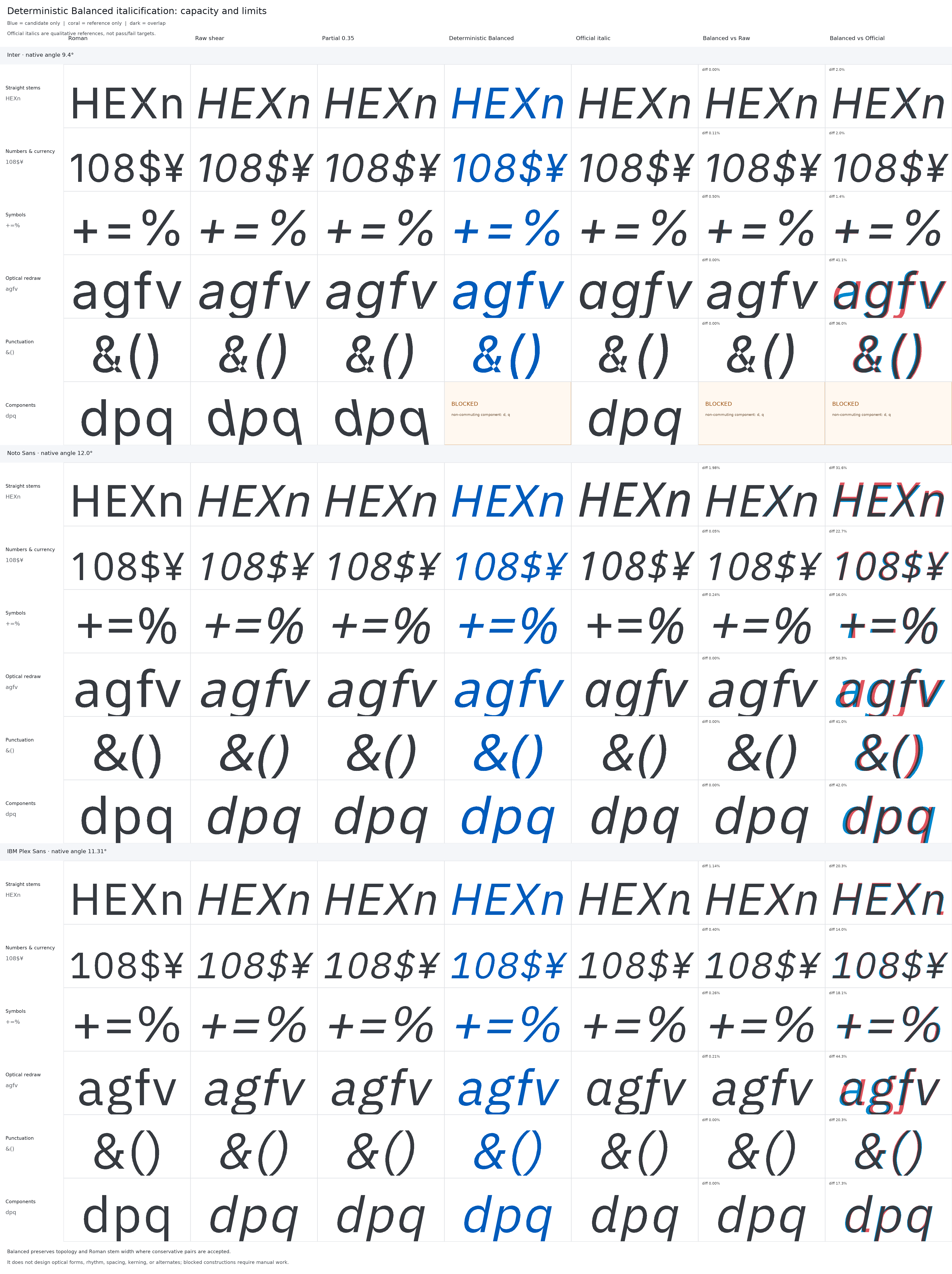
All generated outlines preserved topology and all reviews preserved their source layers. Balanced reduced mean source-width error by more than 99.99% versus Raw and the deterministic partial correction in every family. The component analyzer blocked all 23 risky Inter constructions and both risky Noto Sans constructions before apply; Plex had none in this set.
The official italics are shown only as qualitative references. Their large
differences are useful evidence of the tool's limit: real italics contain
deliberate choices about a, g, f, v, ampersands, parentheses, rhythm,
spacing, kerning, alternates, and many other forms. Those decisions should not
be optimized away by a mechanical pass.
The combined sheet below compares Roman, Raw, deterministic partial correction, deterministic Balanced, and official Italic across Inter, Noto Sans, and IBM Plex Sans. It also includes Balanced-versus-Raw and Balanced-versus-official overlays, magnified stem corrections, design-limit examples, and blocked component constructions.
Full evidence and workflow:
- Full-resolution three-family sheet
- Broad-Latin benchmark and clean-room provenance
- Experimental italic guide
glyphs-mcp-italic-first-passskill
The benchmark uses pinned Inter, Noto Sans, and IBM Plex Sans sources under the SIL Open Font License 1.1. No benchmark fonts or sources are committed. The implementation is clean-room work based on publicly described behavior; it does not call, inspect, decompile, or copy Italify or another proprietary implementation.
I would be interested in examples of component constructions or scripts where the conservative detector is too cautious, as well as cases where the mechanical starting point saves useful drawing time.
Publishing note
This is a draft. Replace the main links with release or documentation links
if the release is published from another branch, and upload the full-resolution
PNG directly to the Glyphs Forum if its Markdown renderer does not expand the
repository image.